Archive for the 'physics' Category

What is going on at the Sun?

Saturday, February 2nd, 2019

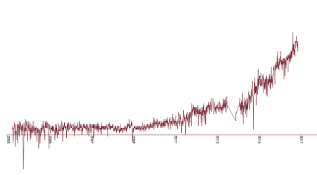
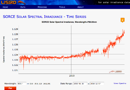
In the randform blog post Information about solar irradiance measurements sought, I had posted a visualisation of irradiance data from the Laboratory for Atmospheric and Space Physics (LASP). In the post it was discussed that there could be a rise in irradiance based on the data from their SORCE mission. I think the rise is also somewhat visible in this interactive plot at the Interactive Solar Irradiance Data Center (LISIRD)…that is it is visible until about July 2015. In this post I also posted a picture of the line 774nm, i.e. “red light” which is slightly out of the visible spectrum. The reason was that it seemed that specific line ranges displayed a stronger rise than others (see circles in the other image in this post). Back then I even made some screenshots from the LISIRD visualization, here you can see the close-by line 798.83nm:

Here it is again in my visualization:

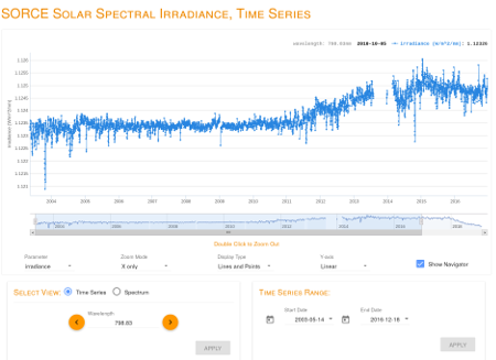
Both visualizations look pretty much the same apart from some visualization effects. But this is how the line in the above time range (here until Dec 18 in 2016) looks as of today in the new LISIRD app:

So things look very differently since about early summer 2015. Is this a correction?
(more…)

simple greenhouse gas models

Sunday, July 29th, 2018

Rotatable with your mouse after you click on “Read the rest of this entry“.

Most of randform readers might have heard that the socalled greenhouse effect is one of the main causes of global warming.

The effect is not easy to understand. There are two posts which give a nice intro to the greenhouse effect on Azimuth. One is by Tim van Beek and one is by John Baez.
The greenhouse effect can also be understood in a slightly more quantitative way by looking at an idealized greenhouse model.

In the above diagram I now enhanced this idealized greenhouse model (as of Jan 2017) in order to get an idea about the hypothetical size of the effect of an absorption of non-infrared sunlight and it’s reradiation as infrared light, i.e. the possibly effect size of a certain type of fluorescence.

I sort of felt forced to do this, because at the time of writing (February 2017) the current climate models did not take the absorption of UV and near infrared light in methane (here a possible candidate for that above mentioned hypothetical greenhouse gas) into account and I wanted to get an insight into how important such an omission might be. The simple model here is far from any realistic scenario – in particular no specific absorption lines but just the feature of absorption and reradiation is looked at.
—————————————————————————–
insert April 24, 2023
My first email asking about the inclusion of shortwave (UV and near infrared) radiation into the radiative forcing of methane to Gunnar Myrhe was on Sept. 10, 2015. The last answer I got was in January 2017, when I pointed out in a new email that there are problems with the evaluation of solar radiation, as explained in the randform post Information about solar irradiance measurements sought (see also What is going on at the Sun?). The answer was basically that he is busy with meetings etc.

Meanwhile I had found out, by searching the internet, that the problems had been somewhat adressed.

That is in: Radiative forcing of carbon dioxide, methane, and nitrous oxide: A significant revision of the methane radiative forcing by M. Etminan1 , G. Myhre2 , E. J. Highwood 1 , and K. P. Shine it was found that

Methane’s RF is particularly impacted because of the inclusion of the shortwave forcing; the 1750–2011 RF is about 25% higher (increasing from
0.48Wm−2 to 0.61Wm−2) compared to the value in the Intergovernmental Panel on Climate Change (IPCC) 2013 assessment; the 100year global warming potential is 14% higher than the IPCC value.

The new value came from the inclusion of absorption spectra with shorter wavelengths.

The new value was inserted into climate simulations in:
Understanding Rapid Adjustments to Diverse Forcing Agents
Accordingly the new IPCC report writes in chapter 7: 7.3.2.2 Methane:

The SARF for methane (CH4) has been substantially increased due to updates to spectroscopic data and inclusion of shortwave absorption (Etminan et al., 2016). Adjustments have been calculated in nine climate models by Smith et al. (2018b). Since CH4 is found to absorb in the shortwave near infrared, only adjustments from those models including this absorption are taken into account. For these models the adjustments act to reduce the ERF because the shortwave absorption leads to tropospheric heating and reductions in upper tropospheric cloud amounts. The adjustment is –14% ± 15%, which counteracts much of the increase in SARF identified by Etminan et al. (2016). Modak et al. (2018) also found negative forcing adjustments from a methane perturbation including shortwave absorption in the NCAR CAM5 model, in agreement with the above assessment. The uncertainty in the shortwave component leads to a higher radiative modelling uncertainty (14%) than for CO2 (Etminan et al., 2016). When combined with the uncertainty in the adjustment, this gives an overall uncertainty of ±20%. There is high confidence in the spectroscopic revision but only medium confidence in the adjustment modification.

A very new evaluation in Methane’s Solar Radiative Forcing finds:

Including the impact of SW absorption on stratospheric temperature increases tropopause SARF by 0.039 W m−2 (or 7%) compared to the LW-only SARF.

The article Understanding Rapid Adjustments to Diverse Forcing Agents however also evaluated what a 2% increase of the solar constant parameter shows in the climate models and found (see Fig. 1) that the radiative forcing increases as if one would double the CO2 parameter or triple the CH4 parameter.

—————————————————————————–

The above diagramm shows the earth temperature in Kelvin as a function of two parameters, as given by this enhanced model. The two parameters can be seen as being (somewhat) proportional to densities of a hypothetical greenhouse gas, which would display this type of fluorescence. That is the parameter x is seen as (somewhat) proportional to the density of that hypothetical greenhouse gas within the atmossphere, while y is (somewhat) proportional to the density near the surface of the earth. Why I wrote “somewhat” in brackets is explained below.

The middle of the “plate” is at x=0, y=0 (please hover over the diagram) which is the “realistic” case of the idealized greenhouse model, i.e. the case where infrared absoptivity is 0.78 and the reflectivity of the earth is 0.3. The main point of this visualization is that linearily increasing x and y in the same way leads to an increase of the temperature. Or in other words, although raising x by a certain amount leads to cooling this effect is easily trumped by raising y by the same amount.

As far as I learned from discussions with climate scientists the omission of non-infrared radiation in the climate models was mostly motivated by the fact that an abpsorption of non-infrared is mostly happening in the upper atmossphere (because methane is quickly rising (but there are also circulations)) and thus leading rather to a global cooling effect than a global warming effect and so it in particular doesn’t contribute to global warming. The enhanced simple model here thus confirms that if absorption is taking place in the upper athmossphere then this leads to cooling. The enhanced model however also displays that the contribution of methane that has not risen, i.e. methane that is close to the earth surface, is to warm upon absorption of non-infrared light and that the effect of warming is much stronger than the cooling effect in the upper athmosphere. Unfortunately I can’t say how much stronger for a given amount of methane, since for assessing this one would need to know more about the actual densities (see also discussion below and the comment about circulations). Nonetheless this is a quite disquieting observation.

I had actually exchanged a couple of emails with Gunnar Myrhe, the lead author of this corresponding chapter in the IPCC report, who confirmed that non-infrared light absorption in methane hasn’t sofar been taken into account, but that some people intended to work on the near-infrared absorption. He didn’t know about the UV absorption that I had found e.g. here (unfortunately my email to Keller-Rudek and Moortgat from 2015 whether there is more data for methane especially in the range 170nm-750nm stayed unanswered) and thanked for pointing it out to him. He appeared to be very busy and as drowning in (a lot of administrative) work, so that I fear that those absorption lines still might not have been looked at. That is also why I decided to publish this now. I sent a copy of this post to Gunnar Myrhe, Zong-Liang Yang and John Baez in June 2017, where I pointed out that:

I have strong concerns that the estimations of the global warming potential of methane need to be better assessed and that the new value might eventually be very different then the current one.

– but I got no answer.

(more…)

Work-to-rule?

Saturday, June 30th, 2018

Last year (Jan 2017) there was a long essay in the german newspaper “Die Zeit” (“The time”) about how important a natural scientific evaluation could be for historical research. The essay: “Darum hatte Hitler keine Atombombe” (“That’s why Hitler had no nuclear bomb”) was written by physicist Manfred Popp. A very brief summary of his argumentation is that a lot of historical research about german nuclear research during Nazi times was more or less flawed due to missing knowledge or misinterpretations of physical facts.

(more…)

energy prospects

Sunday, February 25th, 2018

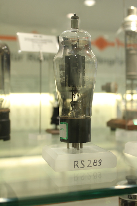
Sende-Pentode RS289 from radio technology museum Königs-Wusterhausen

There was again a discussion with randform reader Oekologisch Interessierter about the development of nuclear energy production. The original post was in Oct. 2010 i.e. briefly before the Fukushima disaster in Mar. 2011 and the outlook cited there looked quite differently from what actually happened.

(more…)

galaxy flush reloaded

Wednesday, November 29th, 2017


pan and zoom as usual

In 2006 Tim played around with swarm simulations in processing and ended up with funny flush like settings. We tweaked the parameters in such a way that it ended up looking like and sounding like a galaxy being flushed down the drain and made it into the art work “dipper galaxy flush” where dipper refers to the wellknown patterns in the constellation Ursa Major. Our comment wasn’t though referring to a particular galaxy there but to galaxies in general – which could include our own.

If you look at the processing code you see that Tim’s simulation doesn’t use e.g. Newtonian gravity, although Tim used a force which is similarily “centralizing” as dark matter.

Inspired by discussions about dark matter and dark energy and general relativity at John Baez’ social media I wanted to get a feeling of how important the feature of dark matter is in order to allow for galaxy formation.
The above is a realtime javascript simulation using purely newtonian gravity with no dark matter but two giant masses (indicated by blue circles, which size is not proportional to the smaller circles) and something that could be called an “inelastic binding”. That is if the distance between masses is smaller than some number then those “close-by” masses behave as if they stuck together as in an inelastic collision, or in other words: the velocity of a mass is set to be the weighted average velocity of the close-by masses (details in the code, how much inelastic collision you want is set by the parameter “mix”).

It was acutally not so easy to find a configuration which somewhat mimicks galaxies, but the above looks a bit as if, I find. If I find the time I may add a 3D viewer. Try yourself – the source code is open.
Here how a scientifically advanced galaxy simulation, which includes dark matter looks on a super computer: World’s first realistic simulation of the formation of the Milky Way and here an interview with the author Lucio Mayer. Just like us many other users think it looks like a filmed flush – if you read the comments.
Here another simulation by Fabio Governato on his youtube channel: The Formation of a Milky Way like Galaxy. He has a whole variety of galaxy formation videos.

remark: the simulation is a modification of Mike Bostocks canvas swarm simulation at https://bl.ocks.org/mbostock/2647922

update 1.12.2017: There was a mistake in the addition of the z-speed, which is now corrected in the above version. Luckily the correction did affect the overall appearance only slightly.

What’s going on at the Ural?

Saturday, October 28th, 2017

Carbontracker

Image from NOAA.

In an earlier randform post I mentioned the connection of methane emissions and geological features. In particular in an area called Vestnesa which is about northwest of Svalbard (look at image 3) high methane emissions were due to plate tectonics. In that post I asked wether this fault couldn’t be eventually part of a plate which arises from a break of the Eurasian plate, i.e. in particular whether there are similar plate tectonical ongoings along the (northern part of) Ural. I was in part drawn to that question because of the above image. In the above image you see a plume (CH4 air masses) starting at the Kara sea and then going down south in the west of a line, which seems to indicate the Ob river. I.e. this plume seems to be going down at least along the northern part of the Ural mountains. The image is on a world scale so this is a bit speculative, but still, it looks as if. But since the resolution is so crude it should also be mentioned that east of the Ob there are major gas fields, like at Novy Urengoy.

(more…)

Mars on earth, part 2 and again on the loss of O2

Sunday, August 27th, 2017

A reoccurring question on randform is: how stable is the current ecosystem on earth? And in particular how stable is it as a not too hostile environment for humans?

A possibility to find out is to isolate living systems.
Some of these experiments of such (more or less) closed artificial ecosystems were mentioned in the 2006 randform post Mars on earth.

And at least one of these long-term experiments more or less partially failed (namely the First mission of Biosphere 2) because, as the Pittsburgh Post-Gazette wrote: Biosphere 2 members “aired out”:

With an admitted leakage rate of just under 10 percent of its atmossphere yearly, oxygen levels inside dropped gradually over the project’s first 15 months, eventually reaching the levels normally found atop a 13,400-foot mountain. Because the oxygen loss was gradual, the crew members were able to continue functioning but their physical activities were eventually reduced to about 70 prcent of normal because of oxygen deprivation before project staffers outside injected more air.

As far as I know the major reasons, why the oxygen levels dropped were never fully established.
The reasons given in the Pittsburgh are differing from what I thought and wrote about the major reasons in the Mars on earth blog post:

the air supply had to be reenforced due to a miscalculation of the air consumption of bacteria in the soil of the greenhouse

where in retrospective I am unfortunately not sure, whether this reason about the decline of oxygen was given in the TV documentation which I had seen about Biosphere 2 or whether this was just my own interpretation of what had most probably happened.

So the question about the stability of the earth ecosystem is last but not least a question of O2 or not O2. And the balance of very tiny organisms may play a very major role in that question.

So amongst others in the post How much O2 will be left? I suggested that

“melting of permafrost could not only lead to more CO2 in the air but also induce a reagression of O2 (which may e.g. be due to a sudden expansion of aerobic organisms)*”

There are also other randform posts which intrinsically look at the O2 (and also CO2) balance. In particular some posts are dedicated to the oceans via studying phytoplankta.
Like the 2009 post about “The tragedies of marine towns” or the 2010 post about phytoplankton decline. Amongst others the posts illustrate again how complicated it is to infer any future developments, and that is even not easy to monitor the developments of microorganisms. Whatsoever -it seems that rather big changes may be underway, which may point to an out-of-balance situation. But as said this is an ongoing discussion and e.g. the phytoplankton post needs to be updated with the finding that it seems (following an article in the new scientist ) that

The rate at which phytoplankton are disappearing as oceans warm has been vastly overestimated by a glitch in models.

And in particular that

Increased CO2 concentrations often have competing positive and negative effects on phytoplankton, with winners and losers among different species.

Where especially the abundance of diatoms seems to be controversial.
That is the NASA study from 2015 Sept. 23 in Global Biogeochemical Cycles sees a clear decline at least in northern regions, while Nature (pay wall) finds:

Climate change enhances diatom growth mainly owing to warming and iron enrichment, and both properties decrease cellular nutrient quotas, partially offsetting any effects of decreased nutrient supply by 2100.

There are some possibilities to get a better overview over the stability of ecosystems from an more abstract viewpoint (see e.g. this article on Quanta) but still.

And because the balance of the microorganisms is so complicated (and in fact heavily influenced by human activity even in a rather direct way (see e.g. algae fuel)) and since models are only models it is important to conduct concrete experiments with closed ecosystems and at least to monitor direct physical quantities like oxygen levels.

So in fact by looking at visualizations of oxygen concentration in various years at NOAA it had been written in another randform post of 2014 that oxygen saturation in the ocean especially in the north seemed to have declined and eventually likewise the oxygen concentration in the air.

Do we know more now?

Unfortunately it seems things got rather worse. That is despite the fact that meanwhile there had been flamboyant announcements by various people to establish even settlements on Moon and Mars, it seems research on closed environments is rather in decline (a brief update here). That is it seems BIOS 3 closed now for real (thats how it sounded following an article in novosti kosmonavtiki) and the last experiments in the direction of a closed system seem to have been the Yuegong-1 mission in May 2014, but maybe I oversaw something.

Worse however seems to me the fact that NOAA seems to have ceased to produce visualizations of the oxygen concentrations.
Is that true?

At least there seem still to be people who look at things. That is in a recent article my observation in this randform post about the decline in oxygen levels was confirmed. (via CNN)
The confirming article is behind a paywall but if you click on the link in the CNN article it is momentarily visible and it’s written:

We find that the global oceanic oxygen content of
227.4 ± 1.1 petamoles (10^15 mol) has decreased by more than two per cent (4.8 ± 2.1 petamoles) since 1960, with large variations in oxygen loss in different ocean basins and at different depths.

and

Five distinct regions with significant oxygen loss stand out that cannot be attributed to solubility changes. These are (1) tropical regions of all basins, which contain most of the upper ocean OMZ, (2) the North Pacific, (3) the South Atlantic, (4) the Southern Ocean and (5) the Arctic Ocean (Table 1, Fig. 1b, Extended Data Fig. 4).

The authors likewise see microorganisms as a potential major cause for the decrease:

This suggests that either multi-decadal variations or changes in ocean circulation induced ventilation, potentially
enhanced by increased upper ocean biological activity, are responsible
for the observed changes in oxygen below 1,000 m.

However as far as I understood their data went only until 2010 and my alarming observation was from the change between 2009 and 2013.

radio technology museum Königs-Wusterhausen, part 3, radio broadcast

Saturday, May 27th, 2017

After a brief history of the radio technology museum Königs-Wusterhausen on the “Funkerberg” (“broadcast hill”) and an overview on the impressive Dieselgenerator here now part 3 of the series. Part 3 deals a bit with the radio broadcasting itself and in particular with the role it played within my family.
(more…)

What’s going on in Fukushima?

Friday, February 3rd, 2017

Some remarks on the recent observations regarding plant 2.
(more…)

Information about solar irradiance measurements sought

Thursday, January 12th, 2017


Planetary science at The Shard: How soon is the sun’s radiation going to be destructive? (apart from the effect on the CCD chip)

This blog post is based on a thread in the Azimuth forum.

The current theories about the sun’s life-time indicate that the sun will turn in about 5 billion years into a red giant. How and when this process is going to be destructive to earth is still debated. Apparently according to more or less current theories there has been a quasi linear raise in luminosity, quoting from p. 3 “Distant future of the Sun and Earth revisited” by K.-P. Schröder and Robert Connon Smith, 2008:

The present Sun is increasing its average luminosity at a rate
of 1% in every 110 million years, or 10% over the next billion years.

Unfortunately I feel a bit doubtful about this, in particular after I looked at some irradiation measurements.
But let’s recap a bit.

In the Azimuth forum I asked for information about solar irradiance measurements. Why I was originally interested in how bright the sun is shining is a longer story, which includes discussions about the global warming potential of methane. For this post I prefer to omit this lengthy historical survey about my original motivations (may be I come back to this later) – meanwhile (see above) there is an also a newer reason why I am interested in solar irradiance measurements, which I want to talk about here.

Strictly speaking I was not only interested in knowing more about how bright the sun is shining, but how bright each of it’s “components” is shining, i.e. I liked to see spectrally resolved solar irradiance measurements and in particular measurements from a range between roughly the frequencies* 650nm and 950nm.

So I had found the Sorce mission, which is a NASA sponsored satellite mission, whose website is located at the University of Colorado. The website provides very nicely an interactive part with a fairly clear and intuitive LISIRD interactive app with which the spectral measurements of the sun can be studied.

As a side remark I should mention that this NASA mission belongs to the NASA Earth Science mission, which is currently threatened to be scrapped.

By using this app I found in the 650nm and 950nm range a very strange rise in radiation between 2003 and 2016 which happened mainly in the last 2-3 years. Here you can see this rise:
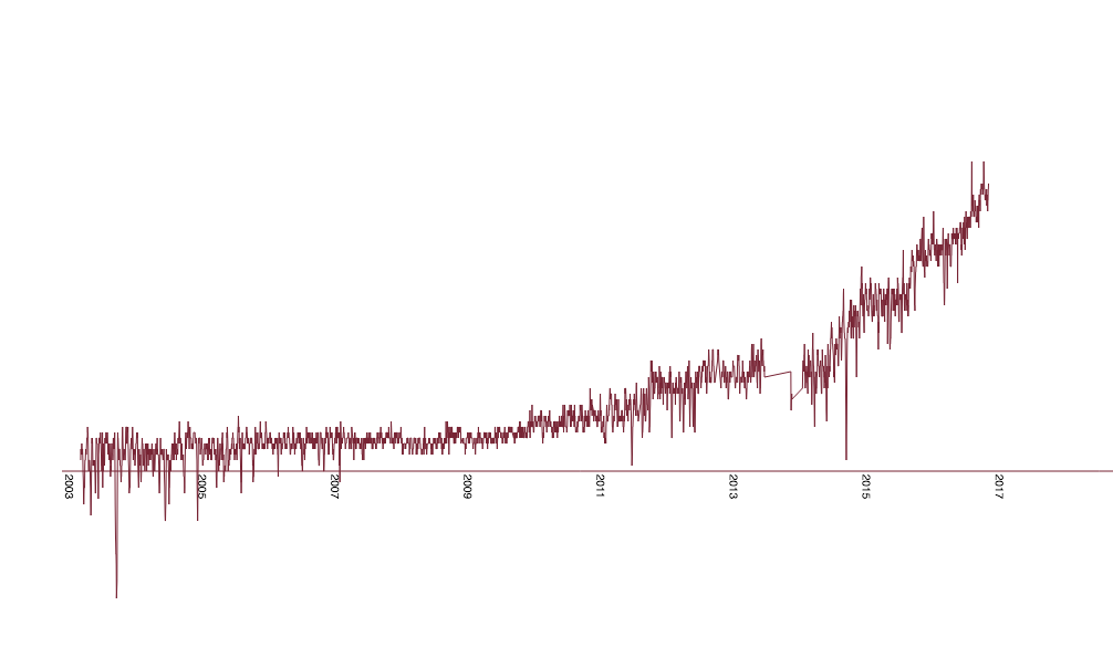

spectral line 774.5nm from day 132 to 5073, day 132 starting Jan 24 in 2003, day 5073 is end of 2016

Now, fluctuations within certain spectral ranges within the sun spectrum are no news, however here it rather looked as if a rather stable range suddenly started to change rather “dramatically”.

I put the word “dramatically” in quotes for a couple of reasons.

Spectral measurements are complicated and prone to measurement errors. Alone the subtle issue of dirty lenses etc. suggests that this is no easy feat and that so this strange rise might easily be due to a measurement failure. Moreover as said it looked as this was a fairly stable range over the course of ten years, but maybe this new rise in irradiation is part of the 11 years sun cycle, i.e. a common phenomenom. In addition, although the rise looks big it may overall still be rather subtle.

But so – how subtle or non-subtle is it then?

In order to assess that question I made a quick estimation (see forum discussion) and found that if all the additional radiation would arrive on soil (which of course it doesn’t due to absorption) than on 1000 sqm you could easily power a lawn mower with that subtle change! I.e. my estimation was 1200 W for that lawn patch. WOA!

That was disconcerting enough to download the data and linearly interpolate it and calculate the power of that change. I programmed a calculation program in javascript for that. The computer calculations revealed 1000 W, i.e. my estimation was fairly close. WOA again!

How does this translate to overall changes in solar irradiance? Some increase had already been noticed. NASA wrote 2003 on it’s webpage:

Although the inferred increase of solar irradiance in 24 years, about 0.1 percent, is not enough to cause notable climate change, the trend would be important if maintained for a century or more.

That was 13 ys. ago.

I now used my program to calculate the irradiance for one day in 2016 between the frequencies 180.5nm and 1797.62nm, i.e. about a quite big part of the solar spectrum and got the value $latex 627 W/m^2$ and computed the difference to one day in 2003 and got $latex 0.61 W/m^2$, which is 0.1% in 13 years, rather then 24 years. But of course this is no average and fluctuations play a big role in some parts of the spectrum, but well – this may indicate that the overall rate (!) of rise in solar radiation may have doubled. And concerning the question of the sun’s luminosity: for assessing luminosity one would need to take the concrete satellite-earth orbit at the day of measurement into account, as the distance to the sun varies or at least average – but still, on a first glance this appears disconcerting.

Moreover for this specific range I mentioned above I calculated the value $latex 192 W/m^2$ for day in 2016 (day 5073), so this would mean for this frequency range the increase in 13 ys was about 0.5% and most of it in the last 2-3 years.

Given that this spectral range has e.g. an overlap with the absorption of water (clouds!) this should at least be discussed.

And indeed one can even see the rise in this range within the solar spectrum without zooming in. See how the spectrum splits into a purple and dark red line in the lower circle?
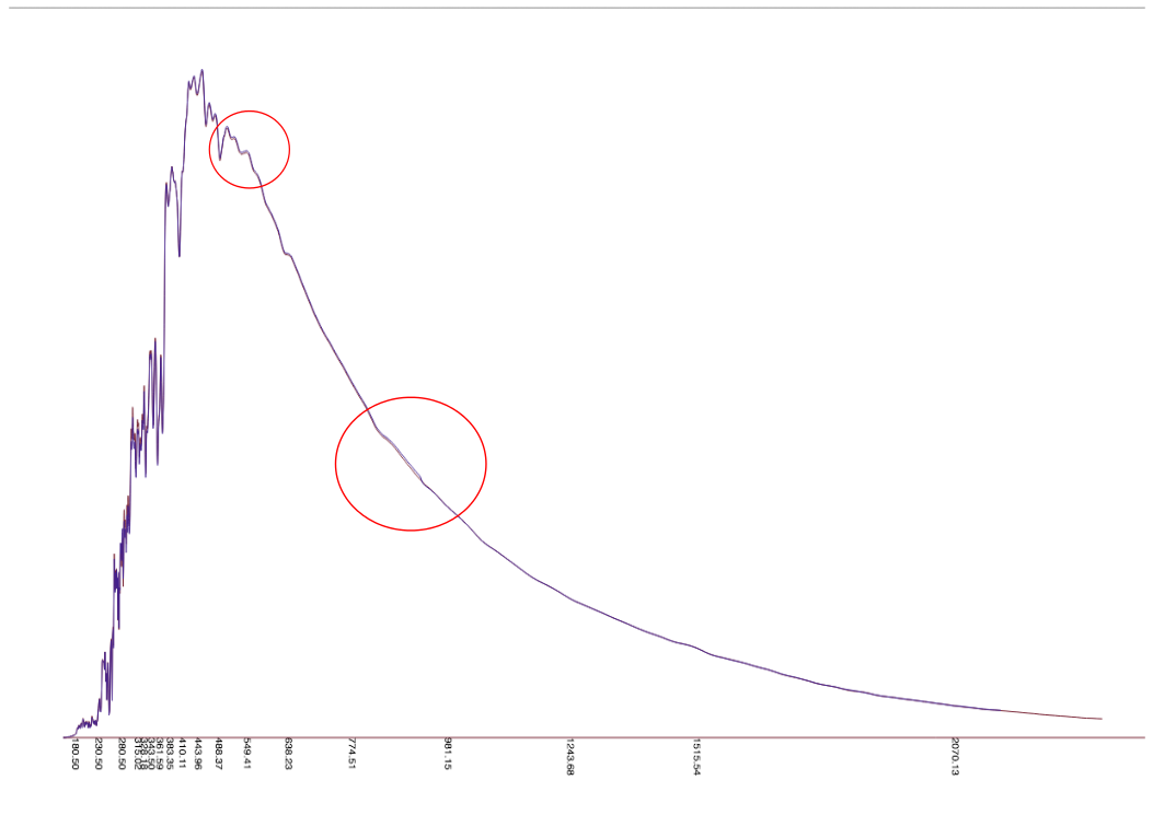

Difference in spectrum between day 132 and 5073

The upper circle display another rise, which is discussed in the forum.

So concluding all this looks as if this needs to be monitored a bit more closely. Finally the theories about the lifetime of the sun are only theories.
In particular it would be important to see wether these rises in irradiance are also displayed in other measurements, so I asked in the Azimuth Forum, but sofar got no answer.

The russian wikipedia site about solar irradiance contains unfortunately no links to russian satellite missions (if I haven’t overseen something) and there exists no chinese or indian wikipedia webpage about solar irradiance. I also couldn’t find publicly accessible spectral irradiance measurements on the ESA website (although they have some satellites out there) and wrote in December an email to the head of the section solar radiometry of the World Radiation Center (WRC) Wolfgang Finsterle with no answer yet.

In short if you know about publicly available solar spectral irradiance measurements other than the LISIRD ones then please let me know.

update Jan 15, 2017: This post appeared also as a guest post on John Baez blog Azimuth with minor modifications, in particular the english was polished by John.

correction Feb, 3, 2017: * frequencies should read inverse spatial frequencies or simply wavelength

update Mar 4, 2019: There is an update to this post at randform post: What is going on at the Sun?