Archive for the 'perception' Category
Wednesday, April 11th, 2007
Just two links to humanoid robot videos as an update (randform posts e.g. here or here).
One video is displaying a quite good jumping humanoid robot, the other video is displaying the already rather wellknown Jules of hansonrobotics.com…..Looking at Jules reminds again at the question about faces as interfaces and the uncanny valley, as e.g. discussed in this randform post.
posted by nad | 3d, bio, perception, robotics | No Comments »
Friday, April 6th, 2007
The use of color in sculpture is a very difficult issue–
(more…)
posted by nad | 3d, art and design, communication, math, perception, software, Uncategorized | 1 Comment »
Thursday, April 5th, 2007
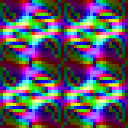
manicone is online now. The coloring of manicone took more time than expected. The coloring made it necessary to consider theories and examples of artistic color compositions, physical mixing properties, technological limitations (calibrations) and infoesthetic basics (For a glimpse onto the problem of coloring and infoesthetics see e.g. this video lecture by tamara munzner (who was a visiting scientist of the TU math department in the mid nineties) or the review on pingmag.
It is a difficult question to find the right portion between colorful and colorful. Colors may be shouting. If they unfriendly shout you down then this is not acceptable. If the are too faint and disappear among the other colors then this is not acceptable either. Due to the transparency properties of manicone, color mixing was likewise an important question.
posted by nad | art and design, math, perception, software, visualization | 4 Comments »
Monday, April 2nd, 2007
Tidying up I found an old work by me from 2001, which I submitted (unsucessfully..:)) to the Karl-Hofer Preis 2001. I included it today in the daytar page.
(more…)
posted by nad | art and design, berlin, communication, perception, Uncategorized | No Comments »
Monday, March 26th, 2007
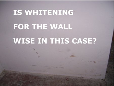
Hospitals are often white in white. This doesn’t help to increase visibility for viruses and bacterias, but white has (at least in some cultures) the symbolic character of purity. However the traces of visitors on white walls need not necessarily be stain, they could be graffiti or art. A famous art example are the works of Robert Rauschenberg. (-> Link for some white Rauschenberg). From Wikipedia:
The “white paintings” produced by Rauschenberg at Black Mountain in 1951, while they contain no image at all, are said to be so exceptionally blank and reflective that their surfaces respond and change in sympathy with the ambient conditions in which they are shown, “so you could almost tell how many people are in the room,” as Rauschenberg once commented.
It is a plain observation that stylish western blogs (as seen from easteastBerlin) are currently often – very white. Concerned about our statistics and some critics about our oriental webdesign, we will follow this white trend for some days and make the vest or theme of our blog purely white and observe our statistics. We take this as a kind of miniblogdesignpoll analog with this poll. Be aware that if a suburbiablog picks up a trend then this may be mainstream.
But coming to the point – todays randform suggestion for web2.0 is a tool, which allows visitors to scribble onto the pages of a blog (a blog graffiti – poesiealbum-tool) – which would make the metaphor of the blog as a white space for communication etc. maybe more tangible. It is of course possible to scribble on Flash or processing applets but these need to be embedded.
In this context one should also mention that Tims jDvi (a viewer for dvi – the output of LaTex) has the option to scribble on the dvi file, which makes e.g. collaboration on a math paper easier.
posted by nad | art and design, berlin, communication, math, perception, software, Uncategorized | No Comments »
Monday, March 19th, 2007
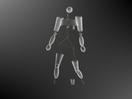
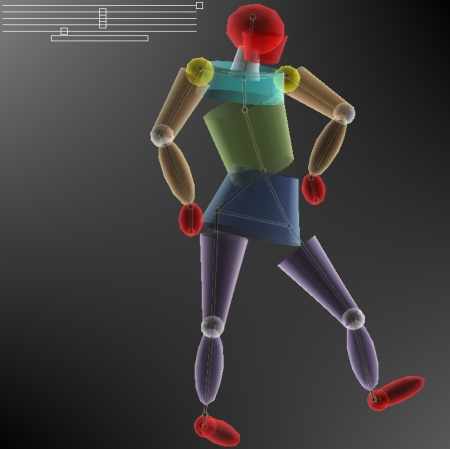
Manicone is a new work by Tim and me (daytar). It is a sketch of a humanoid form in fourdimensional space. It is also a sketch in the sense that we kept the technical realization as simple as possible, i.e. with the application there comes (sofar) no Wii remote or wand, no 3D glasses, no virtual cave like environment etc. – just mouse pointer and sliders.
The modularity of the underlying software jreality however allows in principle for all these extensions (even if Open GL doesn’t have the same transparency capabilities as Tims software viewer). A real 3D immersion in e.g. a cave-like environment with a nice input device may lead to a more direct perceptional access however it is not necessarily allways needed.
An advantage of the simplicity of the application is that it allows for putting Manicone as a Java applet or webstart application on our website (which we will do soon).
Further technical extensions are then a question of the given architectural, technical etc. circumstances. Manicone is a sketch – in any aspect but the work it took to do it.
->10 min. video description of Manicone on youtube
posted by nad | art and design, communication, computer vision, math, perception, software, trips, visualization | 2 Comments »
Thursday, March 8th, 2007
posted by nad | architecture, art and design, communication, math, perception, physics, software, trips, Uncategorized | 1 Comment »
Monday, March 5th, 2007
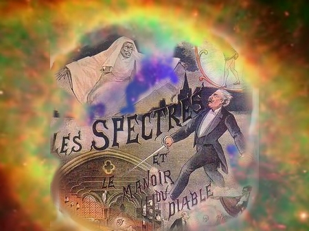
update 22.02.2011: the above image is a mashup of a photoshopped poster for the below referenced film starring at theatre Houdin from an unknown author and some fotoshopped rainbow colors from some astrophysics film.
In 1896 Georges Méliès produced with “Le manoir du diable” the first horror movie in film history. And even more this 2 minute stop-motion special effects film was also the first colour film in film history. The colouring in this film was done by hand on each single image. Colouring black and white films can be seen as a kind of “branding” . It actually took quite a time until it was possible to automatically color films with a -more or less- full color spectrum. This was achieved in 1932 with the Three-strip Technicolor process in the animation “Flowers and Trees”. The first colored feature film in film history was then “Becky Sharp” of 1935 displaying the typical bright technicolor colors.
I was always wondering why films and images of cosmological events like e.g. about the big bang or supernovae look as if they were shot in technicolor, although they were digitally processed.
The reason for this is that the unvisible light spectrum (and the brightness) gets transferred into a visible spectrum via a human interference:
-> Where do those images come from
posted by nad | animation, Film, math, perception, physics, trips, visualization | 2 Comments »
Friday, March 2nd, 2007
a little comment on materials, matter and their perception. artwork by Uta Naumburg:
->chronos chromos concrete
posted by nad | 3d, perception, physics, Uncategorized | No Comments »
Friday, February 23rd, 2007
posted by nad | 3d, architecture, art and design, berlin, bio, math, perception, physics, software, trips, Uncategorized | 22 Comments »