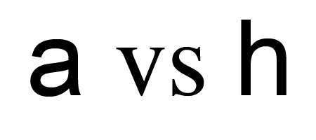
ironic sans has a very enjoyable quiz: 20 logos that use Helvetica redone in Arial. So you can test wether you can tell the two fonts apart or you can just ponder over the influence of typography. I found it very instructive – but TOYOTA was a particularly hard one (I failed there).
posted by timh
on Wednesday, October 7th, 2009 at 10:59 am // art and design, communication.
// RSS 2.0 feed
skip to the end and leave a response // pinging is currently not allowed //
The below box is for leaving comments. Interesting comments in german, french and russian will eventually be translated into english. If you write a comment you consent to our data protection practices as specified
If your comment text is not too rude and if your URL is not clearly SPAM then both will be published after moderation. Your email adress will not be published. Moderation is done by hand and might take up to a couple of days.
