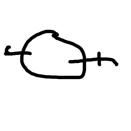
logos and trademarks and memory and more

monochrom performed a nice test on how people remember trademarks.
25 austrians were asked to draw 12 logos (9 of international companies and 3 specially central european ones). One can test ones own ability to single out the “real” logo from look-alikes in this quiz (I enjoyed it and was sort of reliefed that I failed substantially). The link was recently on popnutten.
While I like to read the test in the way that the overall impression of a logo is usually more important than details (at least for the untrained eye) there are exceptions:
Compare for example the german winning entry at the eulda 2006 (logo by Olaf Jünke) with the company’s (usa-rice federation) logo on their web page.
February 13th, 2012 at 3:57 pm
soll dit dit randform logo sein ? ick seh hia nurn kullabolla mit zwee buchstamn ranjeklebt