LeContest
We here at randform are superexcited to present our first reader randform mega contest – simply called LeContest !!
You can win the competition by answering the following question as fast as possible:
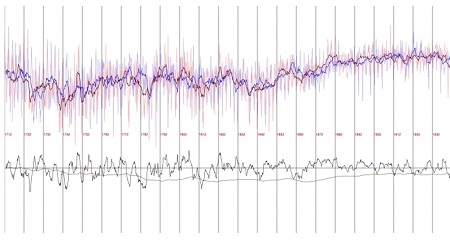
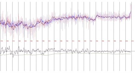
What does the above graphic show?
LeContest Primer: The winner will win an extra honory mention here on randform, his or her name will be mentioned in a seperate blog post.
The question has to be answered by Nov. 27. 2014
If you like those kind of puzzles than it seems you might eventually find a similar task here.
update 3. Sept. 2016: The link to the Azimuth forum is wrong.
The discussion to the image can currently be found here.
Blue curves are global temperature anomalies in odd years starting in 1711 and red curves are global temperature anomalies in even years (HADCRUT 4) starting in 1712. The black jagged curve is the difference between the two curves (red – blue); the less jagged black curve is the integral over that jagged black curve. One sees that the temperature in odd years seems to be on average higher, since the less jagged curve is always below the zero line. This might however also partially be due to partially not so well balanced temperature measurements espiacially in the 18th and 19th centuries or related problems.
In more detail I wrote in that Azimuth project comment:
So as you can see the integral stays clearly below zero (it is actually even scaled by 0.01), but indeed between 1840s or 1860s and 1920s the temperatures seem to flip on average even and odd years at least for that station data and for this case of directly comparing the months in cosecutive years. That is the integral curve ascends. This could thus be correlated with the alledged phase reverse of the Chandler wobble, however I don’t see anything in 2005. But this might eventually be due to the rottening of the temp file. No guarantee for correctness I just hacked that in.


November 28th, 2014 at 10:34 am
Nad, it seems nobody took part in your “scatterplot contest”. This comes as no surprise to me, finally your service to randform readers has been -sorry for the clear words- lousy.
For example my multiply really well meant comments (like this) were left unanswered. And many other comments of randform readers too! You should be glad that you still have readers given that kind of customer service.
And again it seems you did again a scatterplot nobody asked you for. Get yourself a decent job! Isn’t Berlin currently looking for teachers? (I asked an informed Berliner in my vicinity to tell me about job opportunitites in Berlin).
In particular I now don’t want to say something about your benefit morale. But eventually you might understand what I could have said after reading the study: Is the Welfare State Self-destructive? A Study of Government Benefit Morale by Friedrich Heinemann where economists had worked hard to mark out the troubles of a welfare state, from the nontechnical summary:
In the theory section 2 (page 9) it is written:
Since you are a mathematician – the study provides profound empirical assessments:
(p.16)
The study provides econometric evidence, from p.20:
November 29th, 2014 at 10:23 am
Heisst ditte nich: Catering Omnibus?
November 29th, 2014 at 10:30 am
very interesting. This sounds as if one can observe here a really big correlation.
November 30th, 2014 at 2:34 pm
newbie said:
there seems to be a slight language problem with Mr. Heinemann text, that is
I think he meant here a correlation between and not of the size of the welfare state and benefit morale. English prepositions are not so easy for non-native speakers.