April 5th, 2007
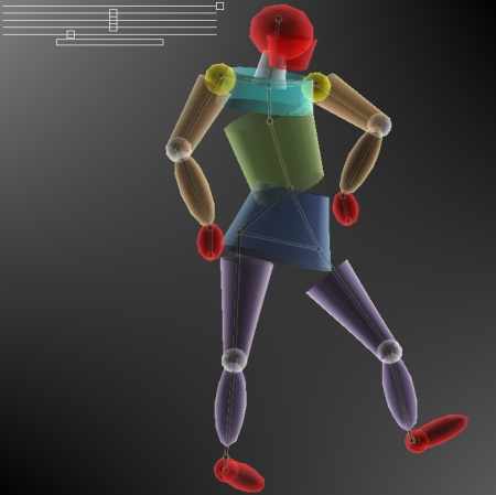
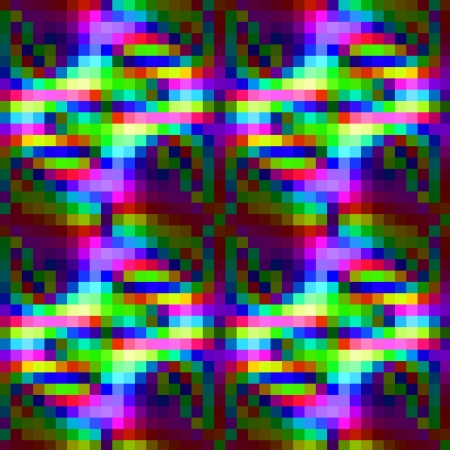
manicone is online now. The coloring of manicone took more time than expected. The coloring made it necessary to consider theories and examples of artistic color compositions, physical mixing properties, technological limitations (calibrations) and infoesthetic basics (For a glimpse onto the problem of coloring and infoesthetics see e.g. this video lecture by tamara munzner (who was a visiting scientist of the TU math department in the mid nineties) or the review on pingmag.
It is a difficult question to find the right portion between colorful and colorful. Colors may be shouting. If they unfriendly shout you down then this is not acceptable. If the are too faint and disappear among the other colors then this is not acceptable either. Due to the transparency properties of manicone, color mixing was likewise an important question.
posted by nad | art and design, math, perception, software, visualization | 4 Comments »
April 2nd, 2007

Tidying up I found an old work by me from 2001, which I submitted (unsucessfully..:)) to the Karl-Hofer Preis 2001. I included it today in the daytar page.
Read the rest of this entry »
posted by nad | art and design, berlin, communication, perception, Uncategorized | No Comments »
April 1st, 2007
images of imaginary worlds (fotographed on a playground) – a followup post to Orbitall.
Read the rest of this entry »
posted by nad | berlin, trips | No Comments »
March 31st, 2007
Just a short link. I had registered in time for the Innovationsforum Interaktionsdesign but was put on a waiting list and finally didnt hear again from the administration. As it turns out I am rather happy about this now, since it is a beautiful day outside and the major informations are and will be on we-make-money-not-art.
posted by nad | art and design, berlin, Uncategorized | No Comments »
March 30th, 2007

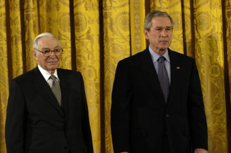
Kenneth Arrow and George Bush – Arrow receives the National Medal of Science, 2004
A previous randform post dealt with collective knowledges and in particular certain basic knowledges which were assumed to be connected with evolution. In the post it was asserted that collective knowledge may -among others- be hidden in the subconscious and that design/marketing may be a mean to detect something of it.
In this series of posts I haven’t yet really adressed the question of HOW a collective knowledge or preference assumes shape, but sofar rather focused on potentially involved mechanisms (maybe to be continued). And in fact the formation of collective preferences (related: the question of formation of coherence and focus) is a very, very difficult – but interesting – issue and this post here is only a first (and almost historical) glimpse into this matter.
Read the rest of this entry »
posted by nad | bio, communication, math | No Comments »
March 28th, 2007
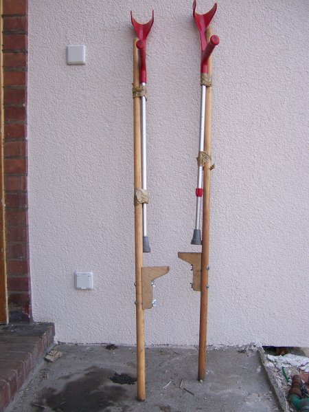
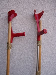
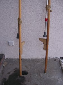
cool or cruel tool? “zwitterpartie” (crutchstilts) – randforms medgadget 2.0 of the day.
posted by nad | art and design, bio, dance, trips, Uncategorized | No Comments »
March 27th, 2007
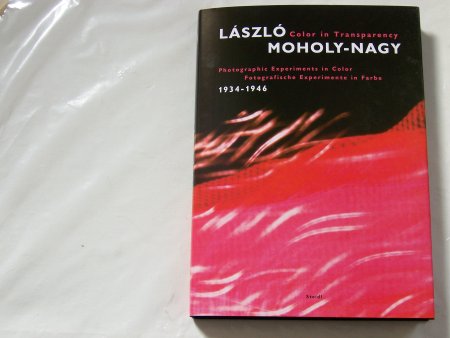
An update to other post about color (e.g.) An interesting process of additiv color mixing is the socalled Dufaycolor process, which was e.g. used by Bauhaus Professor László Moholy-Nagy (see below Dufay Color photograph). A very recommendable book about his photographic works is the book:
Colour in Transparency – Photographic Experiments in Color, Fotographische Experimente in Farbe 1934-1946, edited by Jeannine Fiedler and Hattula Moholy-Nagy for the Bauhaus Archiv in Berlin, Steidl Publishers Göttingen
Read the rest of this entry »
posted by nad | art and design, physics, Uncategorized | No Comments »
March 26th, 2007

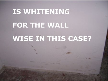
Hospitals are often white in white. This doesn’t help to increase visibility for viruses and bacterias, but white has (at least in some cultures) the symbolic character of purity. However the traces of visitors on white walls need not necessarily be stain, they could be graffiti or art. A famous art example are the works of Robert Rauschenberg. (-> Link for some white Rauschenberg). From Wikipedia:
The “white paintings” produced by Rauschenberg at Black Mountain in 1951, while they contain no image at all, are said to be so exceptionally blank and reflective that their surfaces respond and change in sympathy with the ambient conditions in which they are shown, “so you could almost tell how many people are in the room,” as Rauschenberg once commented.
It is a plain observation that stylish western blogs (as seen from easteastBerlin) are currently often – very white. Concerned about our statistics and some critics about our oriental webdesign, we will follow this white trend for some days and make the vest or theme of our blog purely white and observe our statistics. We take this as a kind of miniblogdesignpoll analog with this poll. Be aware that if a suburbiablog picks up a trend then this may be mainstream.
But coming to the point – todays randform suggestion for web2.0 is a tool, which allows visitors to scribble onto the pages of a blog (a blog graffiti – poesiealbum-tool) – which would make the metaphor of the blog as a white space for communication etc. maybe more tangible. It is of course possible to scribble on Flash or processing applets but these need to be embedded.
In this context one should also mention that Tims jDvi (a viewer for dvi – the output of LaTex) has the option to scribble on the dvi file, which makes e.g. collaboration on a math paper easier.
posted by nad | art and design, berlin, communication, math, perception, software, Uncategorized | No Comments »
March 24th, 2007
posted by timh | Uncategorized | No Comments »
![]()
